Free Liquid Templates Or Responsive Web Design?
About Our Templates
Our template collection is different than most you will encounter. I don't provide theme based templates for one, as it pertains to subject matter. I provide a universal layout or a painter's canvas for you to use to create your own design.
The images I provide are simple placeholders, used to demonstrate the techniques of swapping and scaling for various device sizes. The techniques may vary from template to template.
I recommend using pictures that you create. Do not use images from so-called free websites. You are only asking for trouble.
The templates are pure HTML5 and CSS3. I don't use javascript. If you wish to add features like off-canvas-menus that require Js, the layouts are simple enough for you to make the change.
What is Responsive Web Design?
In a nutshell, RWD is a method of designing one web page that can be viewed in any size device.
It is the future of modern web design.
You no longer need 2 or 3 different websites for desk tops, tablets and cell phones.
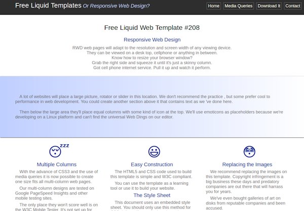
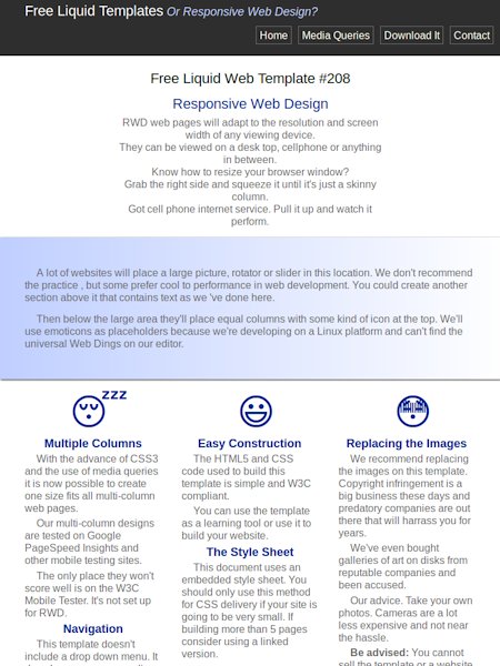
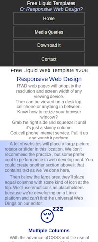
The three web pages pictured on the right (below on smaller screens) are generated by a single page of HTML code and one style sheet.
The first picture is viewing the web page on a desk top or a laptop with a 1280 pixel wide screen.
The second picture is the same code viewed on an Ipad at 768 pixels wide.
The third picture is what the same web page looks like when viewed on a cell phone with a 360 pixel wide screen.
Template 208 demonstrates::
1)Using media query to restructure columns for small screens
2)Using media query to restructure the menu for small screens.
3)Using media queries to change margins and size of text at various break points
Download or Preview
Preview Template 208
Download 208.zip
Squash it all the way to the left and see what happens.
Recommmended Test Sites
Copy the url: http://freeliquidtemplates.com/208/index.html
Paste it into any one or all of these testing tools.
PageSpeed Insights Scores: 100/100 100/100
GTmetrix. Scores: A(99%)/A(100%)
We challenge you to find another source of RWD templates that score even close to this!!
Recommendations will vary between analyzers.
Google uses an undefineable term, above-the-fold, and considers a linked style sheet render-blocking. GTmetrix recommends the linked stylesheet because it can be cached.
Google accepts the scaling of images as long as they are optimized. GTmetrix recommends images be defined in code using absolute values and using media queries to swap sizes.
Mobi Ready considers the absence of Etags a major fail. Both Google and GTmetrix are fine with it.
More About 208
Template 208 contains no images. The icons are generated using code. Okay, that is one of the reasons it scores so high. Hint, hint. If you want performance and speed limit the number and size of pictures on a web page.
This template does include a drop down menu.
Why Go Liquid or RWD?
People are viewing websites these days on devices with screens that range from 240 pixels to 1940 pixels wide; some probably even larger.
Some authorities like the W3C still recommend building different versions of your site for different devices.
That might be an option for professional designers, but the the shade tree designer, in most cases, doesn't have the time or knowledge to do that.
Our Goal
Our goal on this website is to provide the beginner designer with an entry level template that performs well across a wide range of devices.
The designs are as simple as we can make them and are easily modified by those that pursue the concept of RWD and want more sophisticated features.
We Are HTML5 Compliant
Aside from the warning you'll get for not specifying charset using meta tags on some templates, our templates are W3C compliant and are very easy to modify. You will need to define charset in your .htaccess file or add the meta for use on your server.
You should visit our Free HTML 5 Tutorial for a 7 step crash course on building web pages with the methods used in these templates.


