Free Liquid Web Templates
Most of this information is outdated.
We're in the process of converting templates from liquid to responsive web design.
We'll update this page later on!!
Progress has a price.
For Beginners
People write me all the time saying they've bought a template and don't know where to start in the modification process.
Most are trying to use some kind of WYSIWYG editor like Composer. My advice is always the same.
Get rid of the WYSIWYG and learn a little HTML and CSS.
We've created special tutorials for beginners that cover the process of building websites from organization to putting web pages on the internet.
They're all copy and paste but they will get you accustomed to looking at HTML code and CSS.
Start with our Beginner Tutorial and proceed from there to our Advanced Tutor.
You just need to learn the basics to modify your website templates.
Modifying Our Templates
Table of Contents
Controlling the Width of Your Display
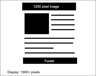
Though the templates are liquid, there are a couple of reasons to set a boundary on how much you want the web page to spread out at higher resolutions.
Can you imagine what your web page would look like if it was viewed on a game machine at over 1900 pixels wide?
Paragraphs would spread out until they were a single long line of text and would become difficult to read.
A 1200 pixel wide image used as a header would be dwarfed at the top of the page.
The 2 lines of CSS shown here below under the body selector control the maximum width that you want your web page to be viewed at. In this case it is 1200 pixels wide.
body {
max-width: 1200px;
margin: 0 auto;
.............
}
Those 2 lines of CSS would cause your display to remain at 1200 pixels wide on a 1900+ pixel monitor resolution.
Your web page would still remain liquid at the lower resolutions and would adapt to the various viewing appliances and browser width settings.
I use 1200 pixels because I am using a 1280X768 resolution monitor.
If you have the luxury of using a higher resolution monitor for testing your designs, you might set the width to 1500 pixels or beyond.
margin: 0 auto, centers the body section within the viewing browser window.
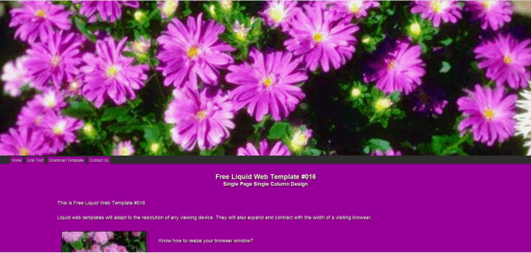
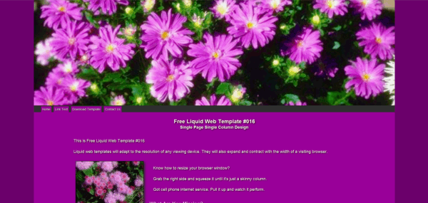
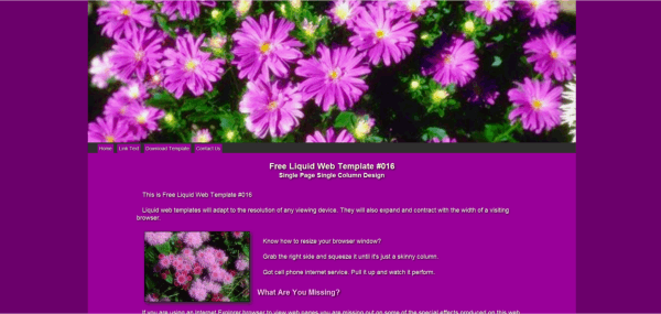
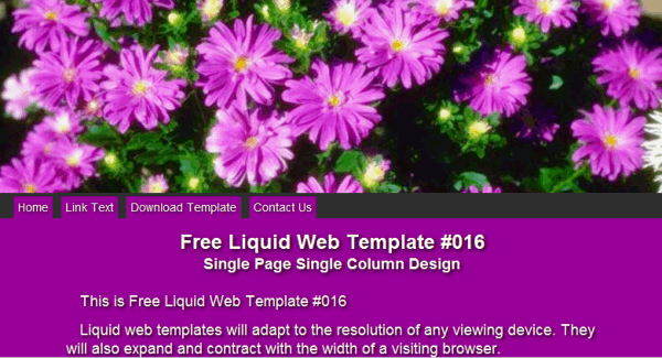
The pictures below show the same template viewed on a 1920x1080 display.
We set the max-width property to different values for each.
Set to 1920 pixels. Most of the lines of text spread to one single line which makes the web page very hard to read.
Set to 1600 pixels. Most of the lines of text still spread to one single line which makes the web page still hard to read.
Set to 1400 pixels. Text lines begin to wrap at 1400, but way to much white space for my taste.
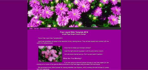
Set to 1200 pixels. This how I wanted the web page to display and the max-width property allows me to control the viewing width..
Set to 1200 pixels. Viewed at 800 pixels. We control the width, but the template remains liquid when viewed at lower resolutions.
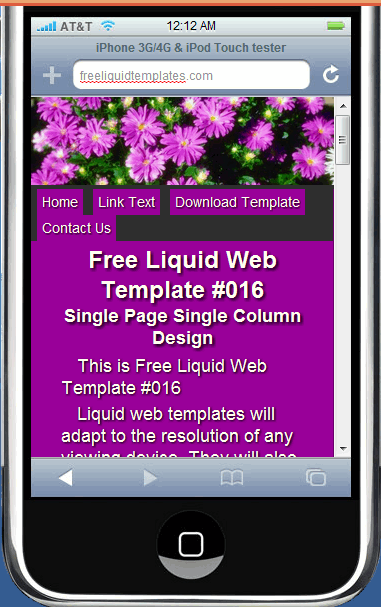
Viewed in iPhone Tester. When we say liquid, we mean liquid. A few adjustments to the navbar and our template works at all resolutions.
Changing Default Settings
Default settings for color and font are set at the top of the style sheet under the body selector.
body {
...........
color: #0e0e0e;
background: #0f0f0f;
font-family: Arial, verdana, tahoma , serif;
font-style: normal;
font-weight: 500
}
If you use this method, you only need to add color and font settings for family, style and weight, when you want them to be different for a specified page element.
If you want to avoid Warnings when you validate your style sheet at the W3C, don't specify the same colors for color and background.
If you wanted your default font-family to be tahoma instead of arial, just change the order and put your desired font-family first in the list. If you wanted to use another font-family like times roman, you would add it to the list and place it first.
Changing the Navigation Bar
We've tried to provide a navigation bar that is generic and works the same on any web page.
If you don't have a lot of experience with CSS, we recommend you leave the CSS as it is.
You can however add and remove buttons and drop downs as needed.
Do a little planning before you start adding buttons. You don't want too many across the top of the page. Try to group them as best you can and add drop downs instead of singles.
The HTML for the list is basic and uses lists nested within lists to create the drop downs.
The code here is similar to that used in the templates.
<ul class="hnavbar">
         <li><a href="pagename.html">Visible Text</a></li>
         <li><a href="#heading">Visible Text</a>
            <ul>
               <li><a href="pagename.html">Visible Text</a></li>
               <li><a href="pagename.html">Visible Text</a></li>
               <li><a href="pagename.html">Visible Text</a></li>
               <li><a href="pagename.html">Visible Text</a></li>
            </ul></li>

</ul>
The code for a single button is just a list item and looks like this:
<li><a href="pagename.html">Visible Text</a></li>
The code for a parent with 4 drop downs is shown here:
 <li><a href="#heading">Visible Text</a>
            <ul>
               <li><a href="pagename.html">Visible Text</a></li>
               <li><a href="pagename.html">Visible Text</a></li>
               <li><a href="pagename.html">Visible Text</a></li>
               <li><a href="pagename.html">Visible Text</a></li>
            </ul></li>
We just nest a new list within a list item.
Notice that we direct the parent link to the heading division using #heading. If you want parent links to be active, just add an HTMLpage name.
If you wanted 10 drop downs under this parent link you would add 6 more list items.
If you wanted just 2 drop downs under the parent you would remove 2 list items.
Changing Content Background Color (multi column Pages)
On templates that use multiple columns, the main, right and left (if used) divisions are nested within a container division called content-background
The content-background division stretches with the height of the longest column to give the appearance of equal columns.
.content-background {
width:100%;
margin: 0 0;
padding: 0 0;
float: left;
background: #ffffff}
Change this line: background: #ffffff to alter the background color of the content section.
Beginners should stick to one color for all multiple columns.
Replacing the Header Image
There are 2 styles of headers in our templates.
Some use a graphic text image like this:

You can order a replacement with your own text by using our simple order form.
When you receive it via email, just save it in your images folder and it will replace the generic header image.
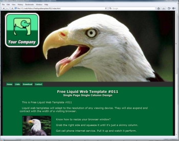
Many of the templates use a header image like this:

You must use a photo editor like PhotoScape (freeware) to place the text on this type of header.
The text on the image above was added using PhotoScape. Someone with a little artistic taste might do much better.
Search: PhotoScape on Google.
Placing Pictures Within Content
When placing your own pictures within the visible content on your web page,we recommend that you follow the procedure we used.
Set them within a paragraph tag and add the positioning preference using the style="" attribute.
Left Alignment:
<p><img src="imagename" alt="image description" style="float: left"></p>
Center Alignment:
<p><img src="imagename" alt="image description" style="display: block; margin: 0 auto"></p>
Right Alignment:
<p><img src="imagename" alt="image description" style="float: right"></p>
To control the amount of text that flows beside a picture, or to break the text at a desired location use the: <br clear="all"> tag.
Mobi Conversion
Here's how one of our single column templates looks on iPhone Tester.
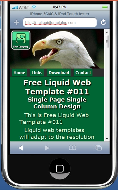
A few simple adjustments were made like using 4 short drop down buttons.
We also used a better method of adding the site logo.
We used a simple graphics program to merge the logo with the header.jpg background image.
A free photo editor like PhotoScape will serve the purpose well. You can also use Photoscape for creating your own full width headers. Easily resize them to any width. You'll find it on Google.(It's freeware)
The same template viewed at 1280X1024 is shown on the right.
We're pretty close here to a liquid design that is just as serviceable at high and low resolutions.
I do recommend single column designs if your goal is a website that can be viewed at all resolutions.
Adjusting Size of Text
It doesn't matter what method you use to size your text it's all based on the em which is 16 pixels .
If you were to define no settings for font-size in your CSS, it would default to 16 pixels for your paragraphs and 24 pixels for h1 tags.
Each page element would display in its default size.
Once again, if you are designing a one size fits all web page that can be viewed at different device resolutions, the task is a little more difficult.
I've experimented with the different methods: ems pixels percentages.
They all basically do the same thing and produce the same result, so use which ever is easiest for you to understand.
some will tell you that you should use ems because it produces elastic text. That's pure BULLSHIZ!!
All 3 methods adjust to resolution changes. None adjust to browser width without the use of javascript.
If you want to experiment with elastic text, here's the javascript:
<script type="text/javascript">
window.onload = window.onresize = fontResize;
function fontResize() {
document.body.style.fontSize = parseInt(document.documentElement.clientWidth/100) + 'px';
}
</script>
Paste it into the head section of your HTML document.
Test the web page at different monitor resolutions and be sure to resize the width of the browser window.
You will learn as I did, why we don't want to use elastic text.
If you are designing the one size fits all website, here are some text sizes in pixels with their em and percentage equivalents that work pretty well.
I recommend nothing larger than 22 pixels or smaller than 16 pixels.
If you think the 22 pixel setting is still too large for hand held devices, I suggest building 2 different websites.
| 16px | 100% | 1em |
| 18px | 112.5% | 1.125em |
| 20px | 125% | 1.250em |
| 22px | 137.5% | 1.375em |
Text Shadow
All of our templates that display light colored text use text shadow.
You'll see a lot of references to the Internet Explorer browser because of it.
It was the last major browser to support shadowed text.
They finally woke up when they released Explorer 10!!
I never liked the browser but it is used by a lot of folks because it comes with most of the new hardware you buy these days.
Many don't know that the other major browsers are free and are better for viewing websites.
Okay, back to the subject!!
I experimented on many of the templates, making adjustments to the amount of shadow and blur that works well at all resolutions.
Here's the best solution I've come up with:
text-shadow: 1px 2px 0px #202020
You can experiment with it but I discourage the use of blur because it doesn't translate well to the lower resolutions.
The settings are: horizontal shadow, vertical shadow, blur and color.
If you add blur, be sure to test at lower resolutions.
Box Shadow
You can add box shadow to any box element.
Most browsers support box-shadow.
I use this line in the style sheet:
box-shadow: 5px 5px 10px #202020;
The values are the same as text-shadow, but there some other optional values. I don't recommend: spread and inset until you get some experience.
Converting to HTML 5
Note: All of our templates have been converted to HTML 5. If you have a document you want to convert here are a few changes you can make.
Change the doctype and a couple of lines in the head section and your web page is valid HTML 5.
Change the doctype to:
<!DOCTYPE html>
Replace these 2 lines in the head section:
<meta http-equiv="Content-Language" content="en-us">

 <meta http-equiv="Content-Type" content="text/html; charset=utf-8">
with
<meta charset="UTF-8">
That's it. You're running valid HTML 5.
New in HTML 5
All converted templates use recently added tags like header, section, aside, nav and footer to improve the structure of the documents.
In most cases they can be manipulated in the style sheet using the same methods you would for division tags.
Exceptions: Do not nest footer tags. Divide your footer using division tags.